Press releases
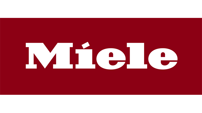
Miele logo: Slightly more space, darker shade of red

Official launch at start of year / Gradual introduction on facades and in showrooms
The family-run Miele company has subjected its central visual branding element to a makeover – its logo. More specifically, the red background around the characteristic lettering has now been enlarged slightly and the vertical height increased in terms of aspect ratio. At the same time, the traditional 'signal red' has given way to a darker shade of red which has already been giving distinction to Miele' branding in the retail trade for several years. The mark designation itself with its striking M and the slanting dot on the 'i' has remained unchanged.
'The outcome is a logo which is even more generous and exudes even greater perceived value whilst at the same time ensuring the necessary continuity', says Dr. Axel Kniehl, Executive Director with the Miele Group covering Marketing and Sales. A slight change to the proportions gives the logo more air to breathe, and bringing the colour scheme of the logo into line with Miele shop furnishings makes for a more harmonious presentation in retail outlets. 'But first and foremost, its use in digital formats such as on websites and in apps has been simplified, opening up new opportunities', Kniehl continues.
The previous logo design can look back on almost 20 years of use. The change was officially launched at the turn of the year. Worldwide conversion will take a while. In particular, the signage on facades and in showrooms will be replaced gradually, allowing for viable transition periods. Axel Kniehl: 'With this cautious adaptation of the logo, we are making allowance for standardisation in our branding across all customer touchpoints in a contemporary way'.
(292 words, 1,793 characters, incl. spaces)
Download as PDF
Carsten Prudent
+ 49 5241 89-1951
carsten.prudent@miele.com


